Graphically Analyzing Variable Interactions in R
# https://github.com/braverock/PerformanceAnalytics/issues/87#issuecomment-370940437
chart.Correlation <- function (R, histogram = TRUE, method = c("pearson", "kendall",
    "spearman"), ...) {
    x = checkData(R, method = "matrix")
    if (missing(method))
        method = method[1]
    panel.cor <- function(x, y, digits = 2, prefix = "", use = "pairwise.complete.obs",
        method = "pearson", cex.cor, ...) {
        usr <- par("usr")
        on.exit(par(usr))
        par(usr = c(0, 1, 0, 1))
        r <- cor(x, y, use = use, method = method)
        txt <- format(c(r, 0.123456789), digits = digits)[1]
        txt <- paste(prefix, txt, sep = "")
        if (missing(cex.cor))
            cex <- 0.8/strwidth(txt)
        test <- cor.test(as.numeric(x), as.numeric(y), method = method)
        Signif <- symnum(test$p.value, corr = FALSE, na = FALSE,
            cutpoints = c(0, 0.001, 0.01, 0.05, 0.1, 1), symbols = c("***",
                "**", "*", ".", " "))
        text(0.5, 0.5, txt, cex = cex * (abs(r) + 0.3)/1.3)
        text(0.8, 0.8, Signif, cex = cex, col = 2)
    }
    f <- function(t) {
        dnorm(t, mean = mean(x), sd = sd.xts(x))
    }
    dotargs <- list(...)
    dotargs$method <- NULL
    rm(method)
    hist.panel = function(x, ... = NULL) {
        par(new = TRUE)
        hist(x, col = "light gray", probability = TRUE, axes = FALSE,
            main = "", breaks = "FD")
        lines(density(x, na.rm = TRUE), col = "red", lwd = 1)
        rug(x)
    }
    if (histogram)
        pairs(x, gap = 0, lower.panel = panel.smooth, upper.panel = panel.cor,
            diag.panel = hist.panel, ...)
    else pairs(x, gap = 0, lower.panel = panel.smooth, upper.panel = panel.cor, ...)
}
Note: This post is NOT financial advice! This is just a fun way to explore some of the capabilities R has for importing and manipulating data.
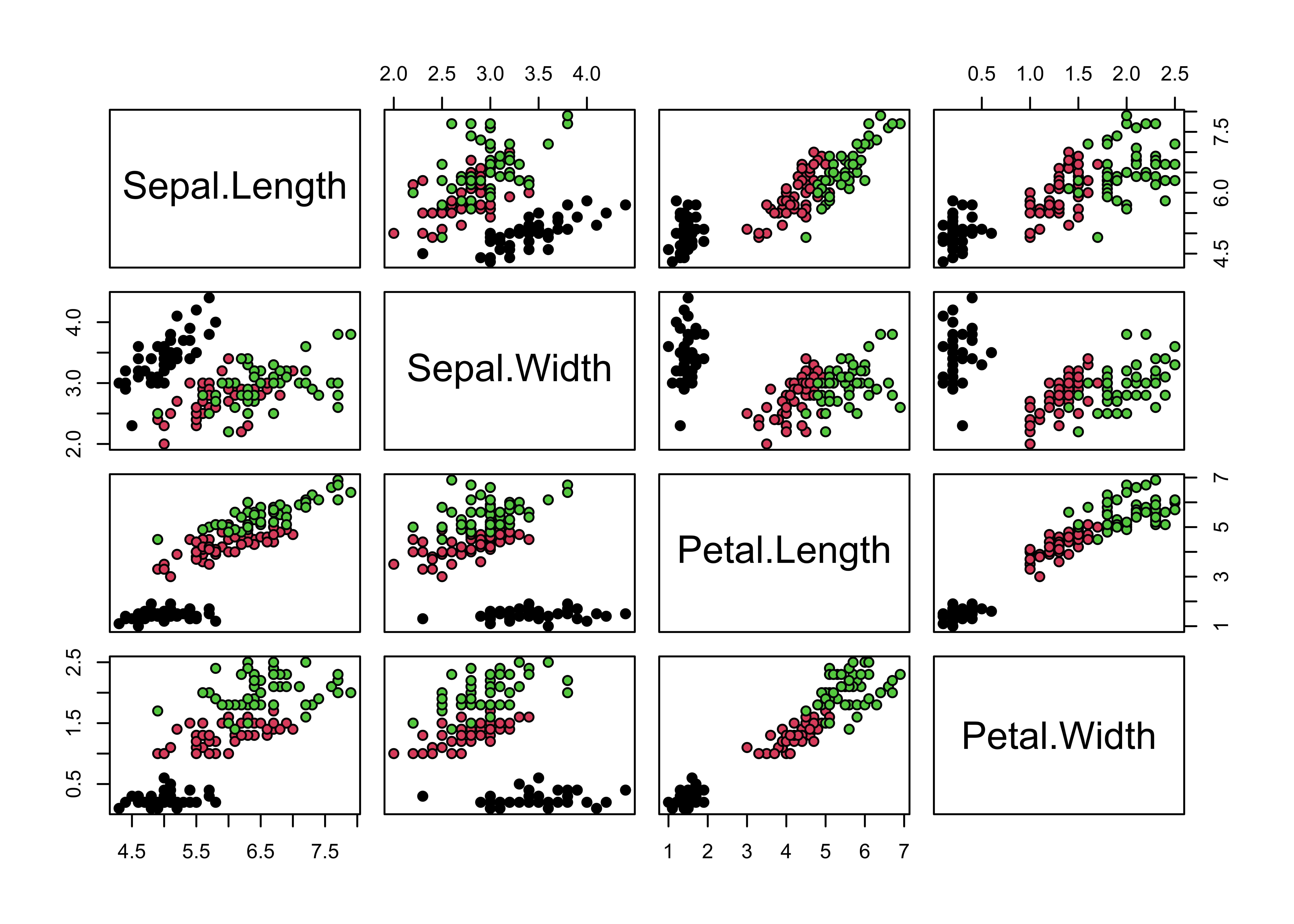
I studied Ecology as an undergraduate, which meant I spent a lot of time gathering and analyzing field data. One of the basic tools we used to look for relationships in a large set of variables was correlation and scatterplot matrices. Each of these requires a single line of code in R:
cor(iris[-5])
#>              Sepal.Length Sepal.Width Petal.Length Petal.Width
#> Sepal.Length    1.0000000  -0.1175698    0.8717538   0.8179411
#> Sepal.Width    -0.1175698   1.0000000   -0.4284401  -0.3661259
#> Petal.Length    0.8717538  -0.4284401    1.0000000   0.9628654
#> Petal.Width     0.8179411  -0.3661259    0.9628654   1.0000000
pairs(iris[-5], bg=iris$Species, pch=21)

The ‘pairs’ function in R contains a lot of additional options, which can be used to make very informative plots. These options can get a little cumbersome, but fortunately several package authors have written wrapper functions that automatically enable some extra magic. Two such packages are psych and PerformanceAnalytics. I happen to prefer the 1 liner from PerformanceAnalytics, but it’s a matter of personal taste:
library(PerformanceAnalytics)
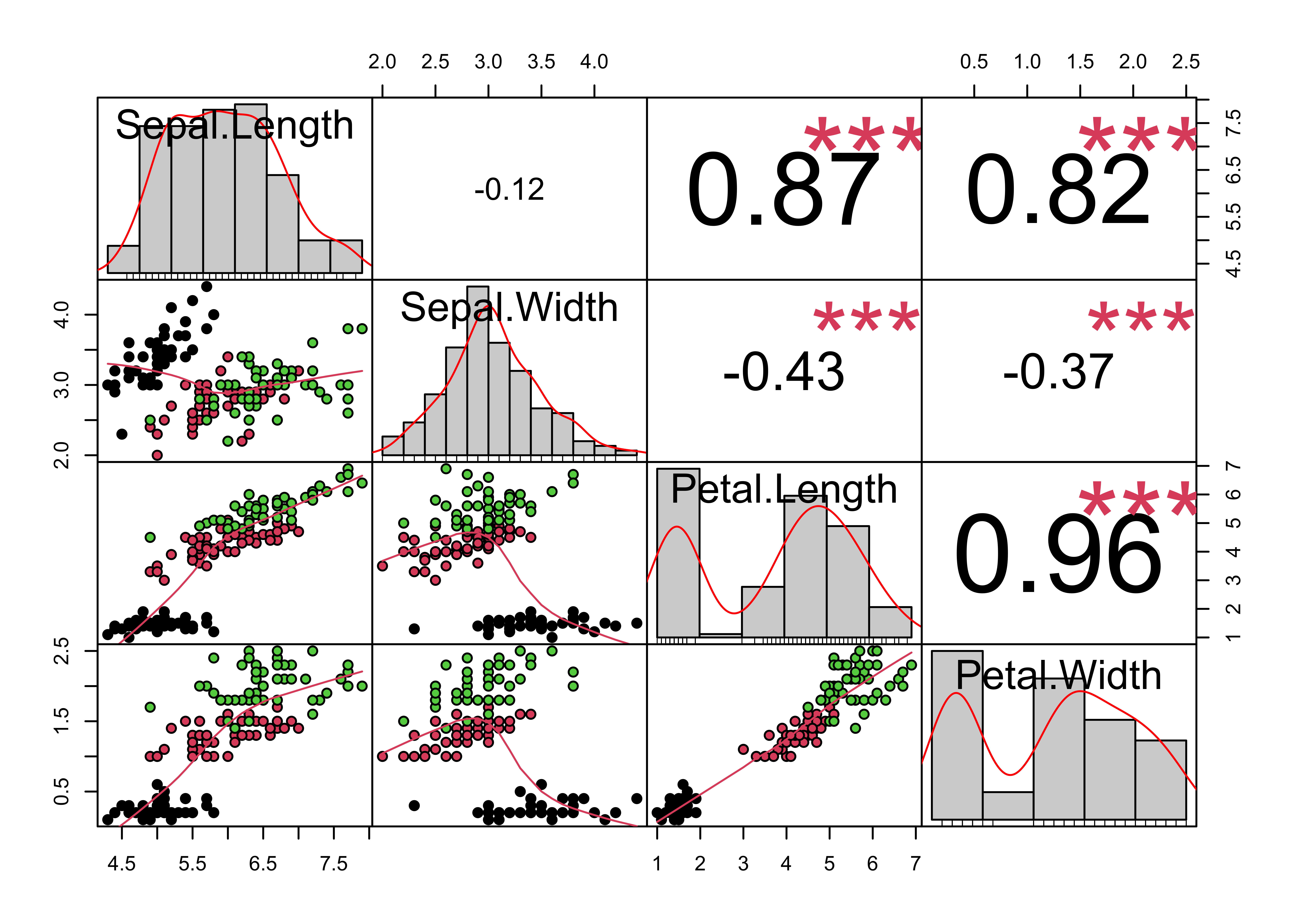
print(chart.Correlation(iris[-5], bg=iris$Species, pch=21))

#> NULL
This chart contains a LOT of information: On the diagonal are the univariate distributions, plotted as histograms and kernel density plots. On the right of the diagonal are the pair-wise correlations, with red stars signifying significance levels. As the correlations get bigger the font size of the coefficient gets bigger. On the left side of the diagonal is the scatter-plot matrix, with loess smoothers in red to help illustrate the underlying relationship. This is one of my favorite plots in R, because it combines a large amount of information into one command and one easy to follow plot. In fact, this plot contains more information than is revealed by the 1st two commands in this post!
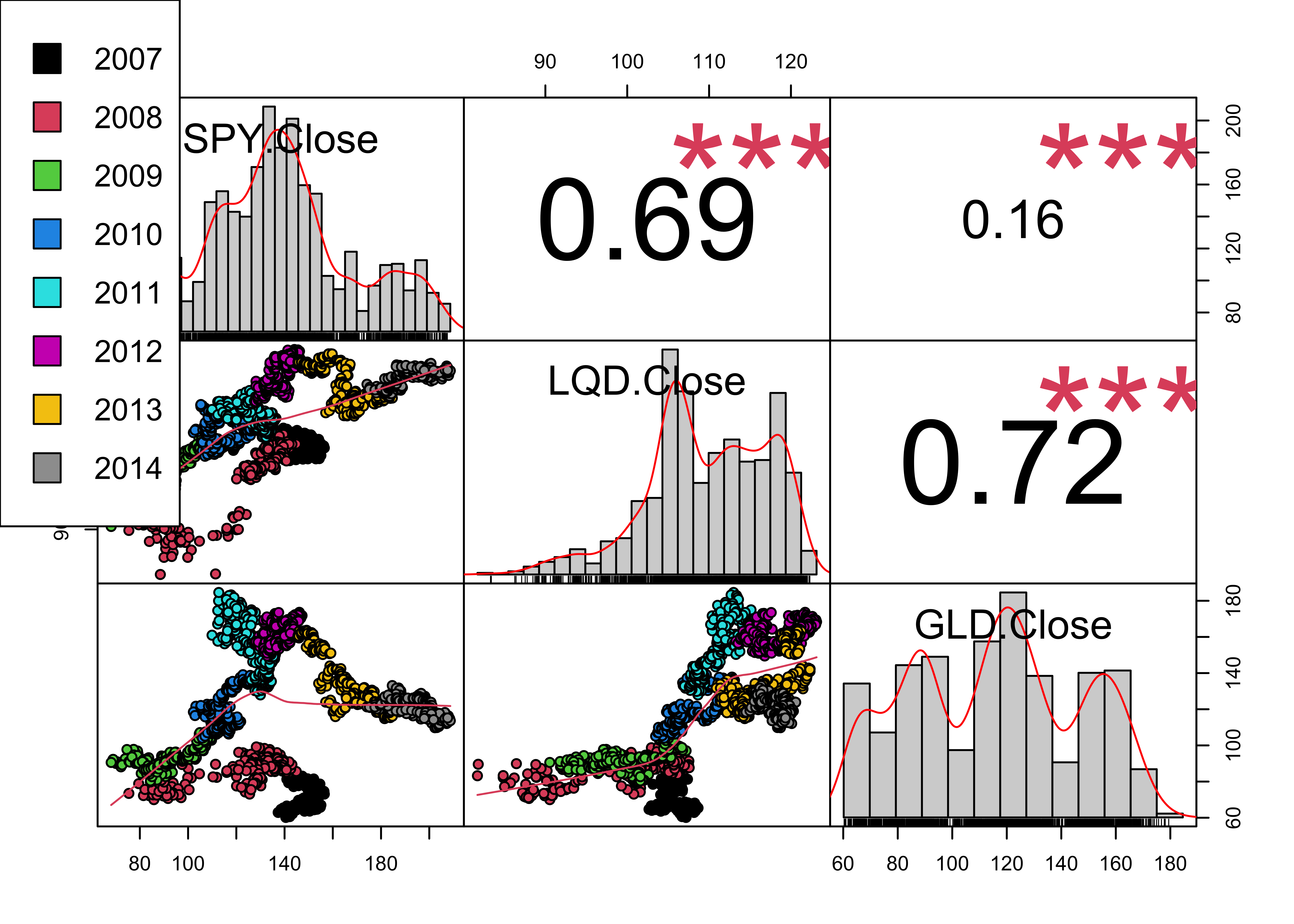
Of course, you can use this command on data from other domains besides Ecology. PerformanceAnalytics is intended for the analysis of financial data, so lets put it through its paces. First we download some financial data (a stock index, a bond index, and a gold index) from yahoo finance using quantmod, and then combine the daily close series of those indexes into one dataframe. I’m not 100% happy with the legend in the plot, but I wanted to show how the correlations between these indexes have changed over the years. I also skipped red (color #2) in the plots and in the legend, because the loess smoother is also red.
library(quantmod)
set.seed(42)
getSymbols(c('SPY','LQD','GLD'), from='2007-01-01', to='2014-12-31')
#> [1] "SPY" "LQD" "GLD"
Data <- cbind(Cl(SPY),Cl(LQD),Cl(GLD))
Year <- as.factor(format(index(Data),'%Y'))
cols <- 1:8
print(chart.Correlation(Data, bg=cols[Year], pch=21))
#> NULL
par(xpd=TRUE)
legend(0, 1, as.vector(unique(Year)), fill=cols)

Finally, I’d like to acknowledge Stephen Turner over on cross-validated for inspiring this post.