Correlations Among Us Stocks: Is It Really Time to Fire Your Adviser?
Note: This post is NOT financial advice! This is just a fun way to explore some of the capabilities R has for importing and manipulating data.
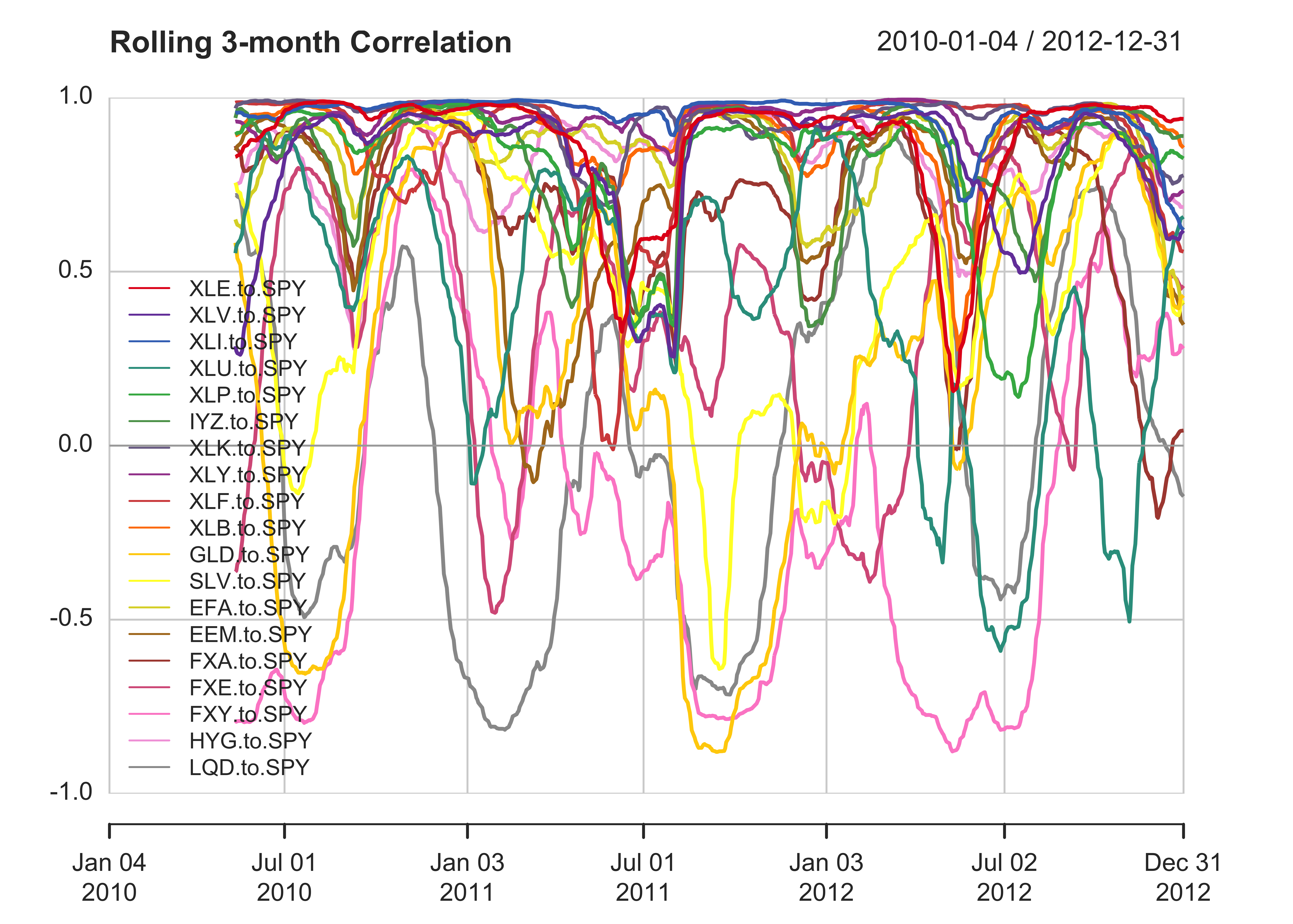
The Financial Times says it’s time to “Fire your Adviser” because correlations among US stocks are at their highest levels since the financial crisis. Unfortunately, they only provide data going back 3 months and it’s in a boring table, rather than an awesome chart. After reading this article, I immediately pulled out quantmod and PerformanceAnalytics in R. I used quantmod to download the daily data (from yahoo finance) for each index listed in the article, and then used PerformanceAnalytics to analyze and graph it. After and hour or so of fiddling around, I ended up with this chart:
library(quantmod)
library(PerformanceAnalytics)
set.seed(42)

symbols <- c('XLE','XLV','XLI','XLU','XLP','IYZ','XLK','XLY','XLF','XLB','GLD','SLV','EFA','EEM','FXA','FXE','FXY','HYG','LQD')

getSymbols(symbols,from='2007-01-01')
#>  [1] "XLE" "XLV" "XLI" "XLU" "XLP" "IYZ" "XLK" "XLY" "XLF" "XLB" "GLD" "SLV" "EFA" "EEM" "FXA" "FXE" "FXY" "HYG" "LQD"
getSymbols('SPY',from='2007-01-01')
#> [1] "SPY"

SP500 <- Cl(SPY)
colnames(SP500)[1] <- 'SPY'

#Function to build a dataframe form a list of symbols
symbolFrame <- function(symbolList) {
    Data <- lapply(symbolList, function(S) Cl(get(S)))
  Data <- do.call(cbind, Data)
    colnames(Data) <- symbolList
    return(Data)
}

#Make a color palette for the graphj
library(fBasics)
colorset <- qualiPalette(length(symbols), name="Set1")

#Chart Correlations
Data <- symbolFrame(symbols)
Data <- Data['2010-01-01::2012-12-31']
print(chart.RollingCorrelation(Data, SP500, legend.loc="bottomleft",colorset=colorset, main = "Rolling 3-month Correlation",width=90))

Each line on this chart represents the rolling correlation between a major asset class and the S&P 500 (represented by SPY). I used a 90-day window to calculate the correlations, so each point on each line is looking backwards at a 90-day timeframe. As you can see, correlations have indeed gone up in the last few months, but there have been other periods in 2010 and 2011 with similarly high correlations.
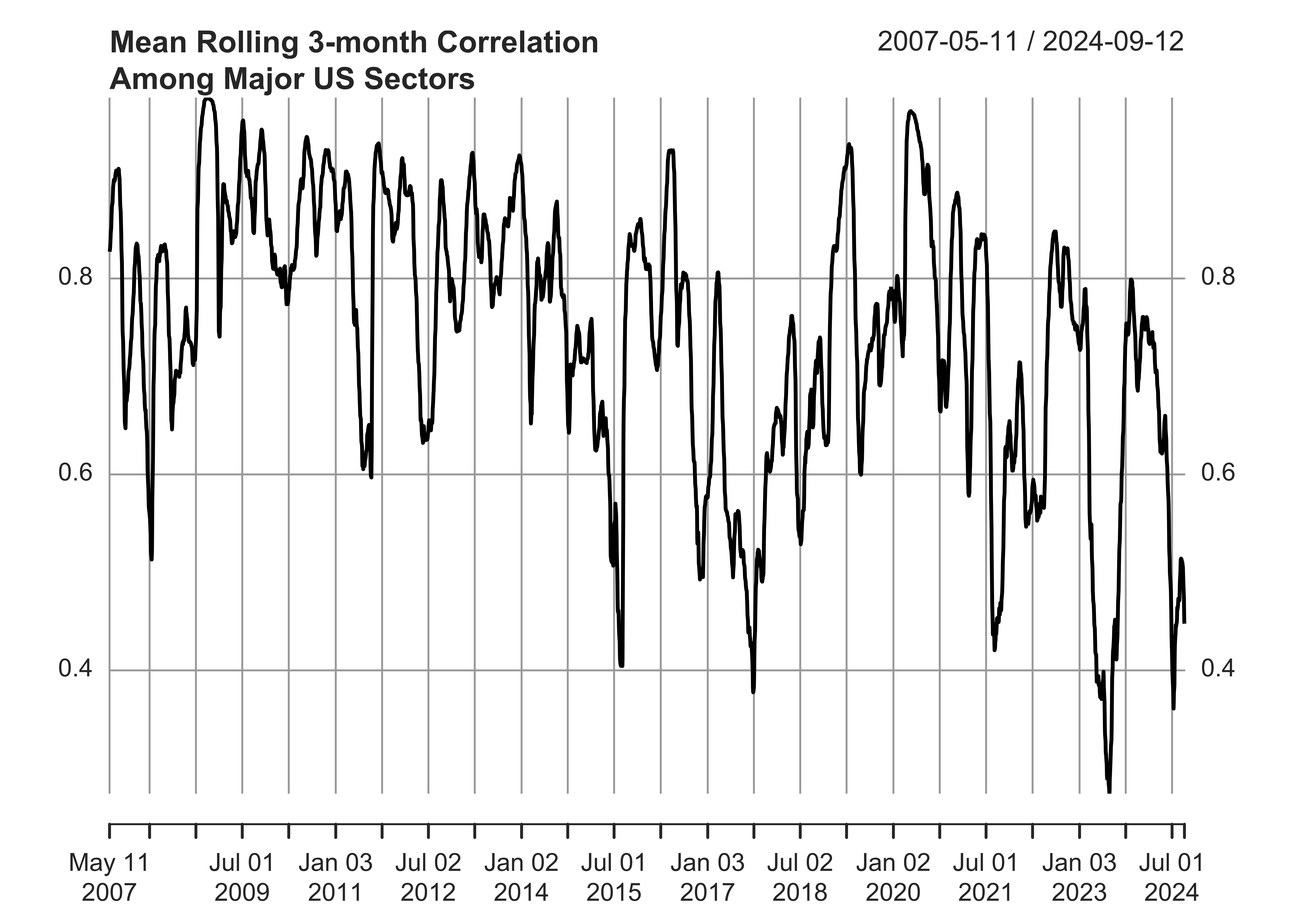
This next chart looks at just the major US sectors, and takes the average of each of their correlations with SPY. This shows the overall correlation of the US stock market since 2007. Again, things are highly correlated right now, but we’ve been here before.
table.RollingCorrelation <- function (Ra, Rb, width = 12, na.pad = FALSE, ...) {
    Ra = checkData(Ra)
    Rb = checkData(Rb)
    columns.a = ncol(Ra)
    columns.b = ncol(Rb)
    columnnames.a = colnames(Ra)
    columnnames.b = colnames(Rb)
    for (column.a in 1:columns.a) {
        for (column.b in 1:columns.b) {
            merged.assets = merge(Ra[, column.a, drop = FALSE],
                Rb[, column.b, drop = FALSE])
            column.calc = rollapply(na.omit(merged.assets[, ,
                drop = FALSE]), width = width, FUN = function(x) cor(x[,
                1, drop = FALSE], x[, 2, drop = FALSE]), by = 1,
                by.column = FALSE, na.pad = na.pad, align = "right")
            column.calc.tmp = xts(column.calc)
            colnames(column.calc.tmp) = paste(columnnames.a[column.a],
                columnnames.b[column.b], sep = " to ")
            column.calc = xts(column.calc.tmp, order.by = time(column.calc))
            if (column.a == 1 & column.b == 1)
                Result.calc = column.calc
            else Result.calc = merge(Result.calc, column.calc)
        }
    }
    return(Result.calc)
}

#Calculate mean correlation among US Sectors & plot
sectors <- c('XLE','XLV','XLI','XLU','XLP','IYZ','XLK','XLY','XLF','XLB')
corrs <- table.RollingCorrelation(symbolFrame(sectors), SP500, width=90)
meancorr <- apply(corrs,1,mean)
meancorr <- xts(meancorr,order.by=index(corrs))
plot(meancorr, main = "Mean Rolling 3-month Correlation\nAmong Major US Sectors")

Here is the code I used to generate these charts. Feel free to comment on my implementation, and I’ll be happy to make any improvements and update the charts.