Backtesting Part 2: Splits, Dividends, Trading Costs and Log Plots
Note: This post is NOT financial advice! This is just a fun way to explore some of the capabilities R has for importing and manipulating data.
UPDATE 9/21/2011: Costas correctly points out that I should lag my strategy vector by one day, as today’s returns are determined the position we chose yesterday. I updated the code, results, and charts to reflect this. Please alert me to any similar errors in the future.
In my last post, I demonstrated how to backtest a simple momentum-based stock trading strategy in R. However, there were a few issues with my implementation: I ignored splits, dividends and transaction costs, all of which can have a large impact on a strategy. I also came up with a better plot to help show how a given strategy compares to a benchmark, and wrapped everything together into one function. c First of all, we need to reload our functions from the last post. These functions define our strategy and analyze its performance.
set.seed(42)

daysSinceHigh <- function(x, n){
   apply(embed(x, n), 1, which.max)-1
}

myStrat <- function(x, nHold=100, nHigh=200) {
    position <- ifelse(daysSinceHigh(x, nHigh)<=nHold,1,0)
    c(rep(0,nHigh-1),position)
}

Performance <- function(x) {

    cumRetx = Return.cumulative(x)
    annRetx = Return.annualized(x, scale=252)
    sharpex = SharpeRatio.annualized(x, scale=252)
    winpctx = length(x[x > 0])/length(x[x != 0])
    annSDx = sd.annualized(x, scale=252)

    DDs <- findDrawdowns(x)
    maxDDx = min(DDs$return)
    maxLx = max(DDs$length)


    Perf = c(cumRetx, annRetx, sharpex, winpctx, annSDx, maxDDx, maxLx)
    names(Perf) = c("Cumulative Return", "Annual Return","Annualized Sharpe Ratio",
        "Win %", "Annualized Volatility", "Maximum Drawdown", "Max Length Drawdown")
    return(Perf)
}
Next, we can test our strategy. I’ve added a couple new indexes:
testStrategy <- function(symbol, nHold=100, nHigh=200, cost=.005, ylog=FALSE, wealth.index = FALSE) {
    require(quantmod)

    #Load Data
    myStock <- getSymbols(symbol, from='2003-01-01')
    myStock <- adjustOHLC(get(myStock),symbol.name=symbol)
    myStock <- Cl(myStock)
  myStock <- na.omit(myStock)

    #Determine position
    myPosition <- myStrat(myStock,nHold,nHigh)
    bmkReturns <- dailyReturn(myStock, type = "arithmetic")
    myReturns <- bmkReturns*Lag(myPosition,1)
    myReturns[1] <- 0
    names(bmkReturns) <- symbol
    names(myReturns) <- 'Me'

    #Add trading costs
    trade =  as.numeric(myPosition!=Lag(myPosition,1))
    trade[1] = 1
    trade = trade*cost
    myReturns = myReturns-trade

    #Make plot
    require(PerformanceAnalytics)
    symbol <- sub('^','',symbol,fixed=TRUE)
    Title <- paste('High=',nHigh,' Hold=',nHold,' on ',symbol,sep='')
    if (ylog) {wealth.index = TRUE}
    layout(matrix(c(1, 2, 3)), height = c(2, 1, 1.3), width = 1)
    par(mar = c(1, 4, 4, 2))
    print(chart.CumReturns(cbind(bmkReturns,myReturns), main=Title, ylab = "Cumulative Return",
                        wealth.index = wealth.index,ylog=ylog))
    print(chart.RelativePerformance(myReturns,bmkReturns, ylab = "Relative Return", main = ""))
    print(chart.Drawdown(cbind(bmkReturns,myReturns),legend.loc = 'bottomleft', ylab = "Drawdown", main = ""))

    #Return Benchmarked Stats
    round(cbind(Me=Performance(myReturns),Index=Performance(bmkReturns)), 2)
}
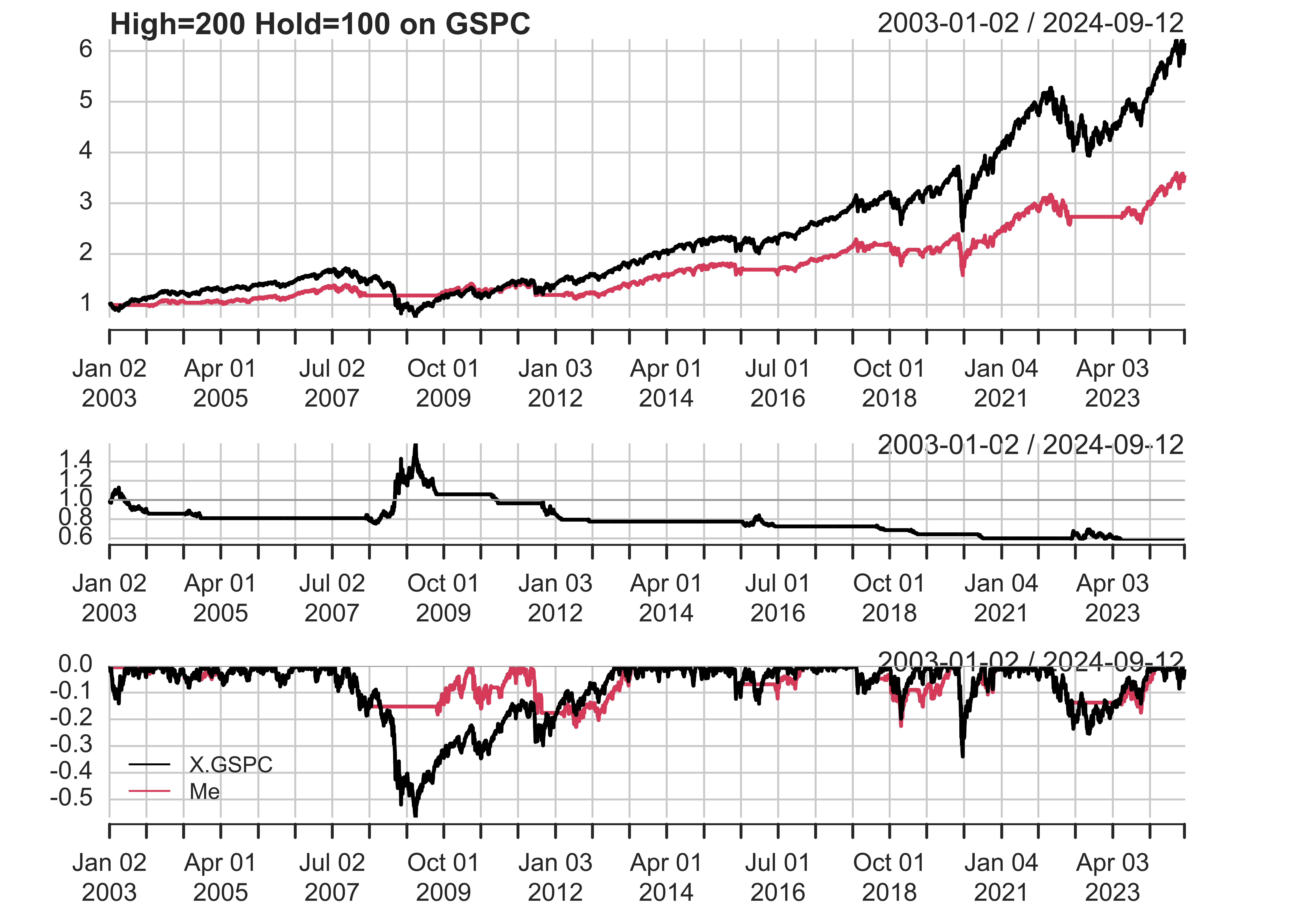
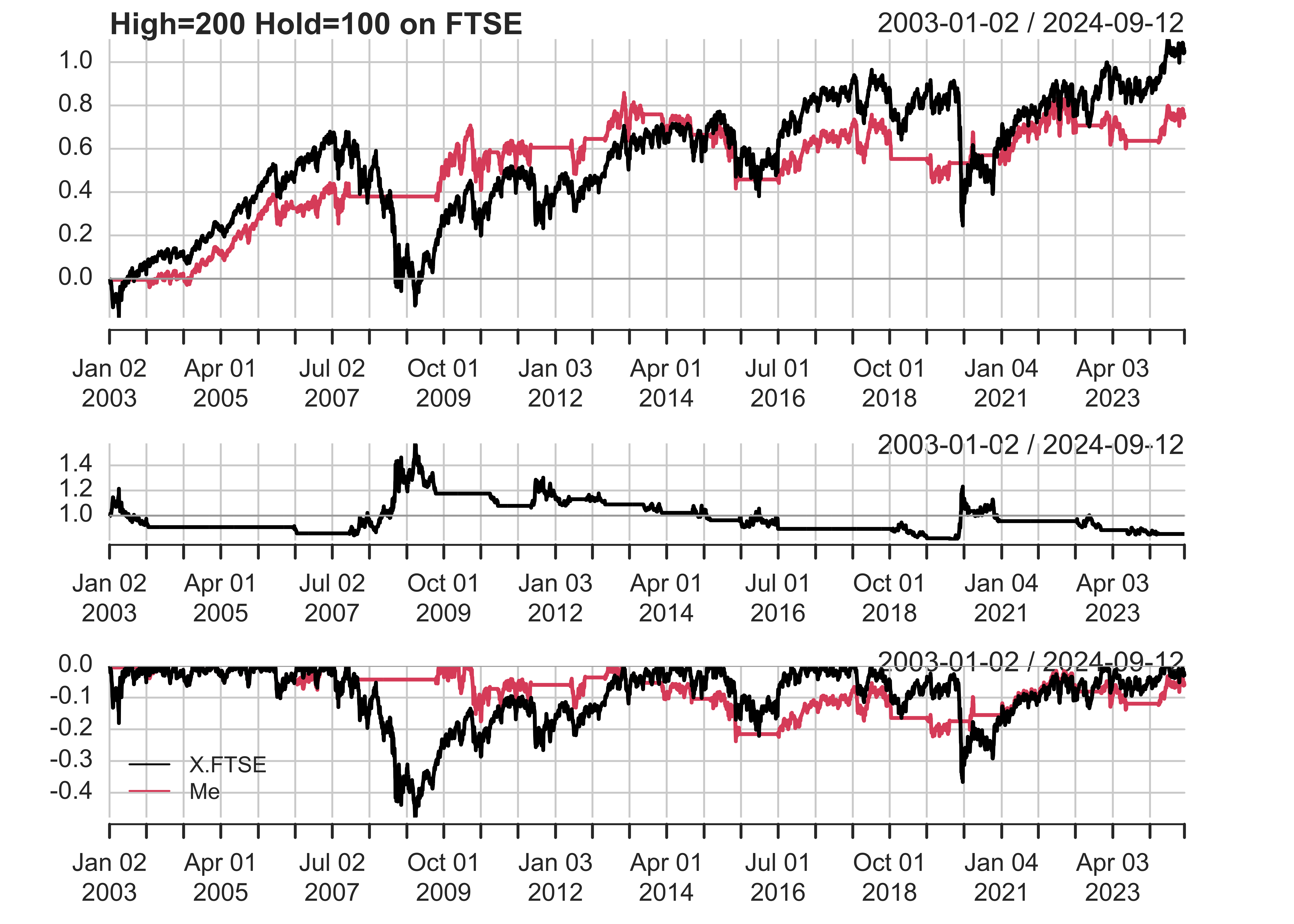
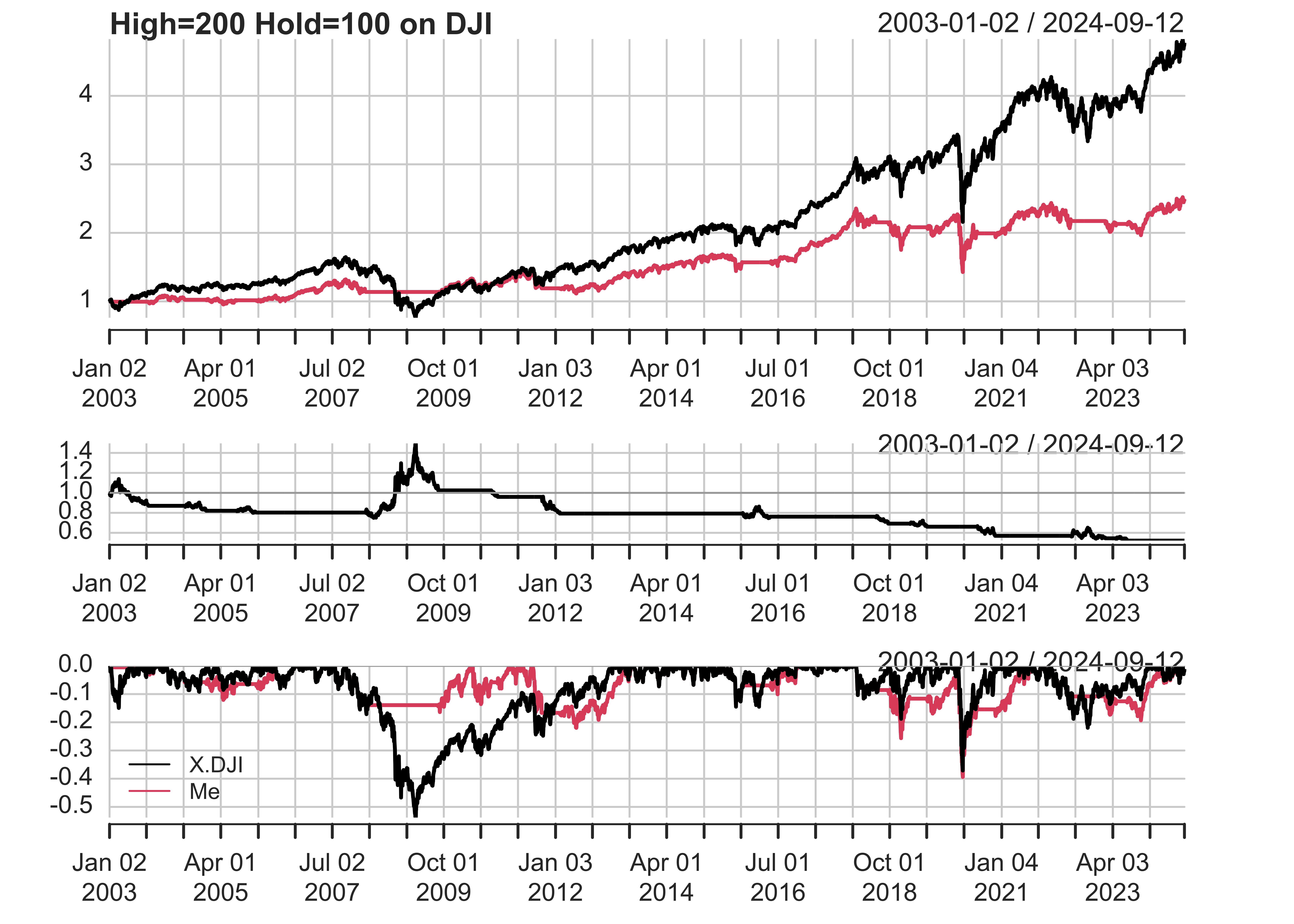
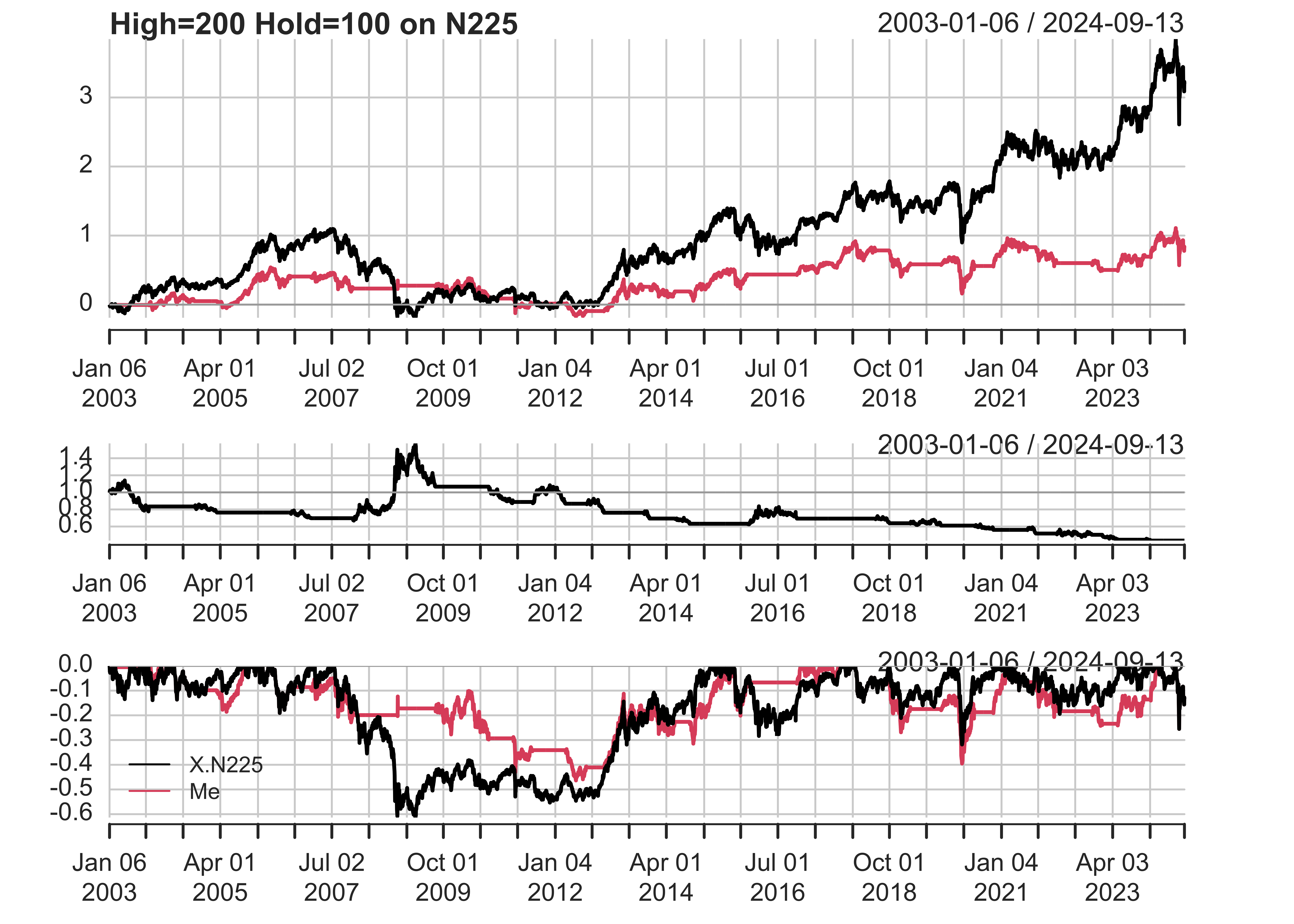
This function does a lot of lifting: 1. It loads the data and adjusts the closing price for splits and dividends. It uses the splits/dividends data from yahoo, but performs its own, more accurate calculations. 2. It determines a position series, based on the “daysSinceHigh” function. This part is the same as in my last post. 3. It determines trades, which are defined as days when today’s position is different from the previous day’s positions. I assumed that transactions costs are 0.5% of equity, so on trading days I subtracted 0.005 from my Returns. 4. It makes a plot. This plot is different from the charts.PerformanceSummary we used last time. The first plot shows cumulative returns of my strategy and the index, while the second plot shows the relative performance of my strategy over the benchmark (also known as alpha). The third plot shows drawdowns. 5. It returns a data table of statistics, comparing the strategy to the benchmark.
I tested this strategy on GSPC, FTSE, DJI, N225, EEM, EFA, and GLD. (The last 3 are ETFs). The strategy performs well on some indexes, and poorly on others. Here’s the results of my backtest:
testStrategy('^GSPC',100,200,ylog=TRUE)
#>                             Me   Index
#> Cumulative Return         2.54    5.14
#> Annual Return             0.06    0.09
#> Annualized Sharpe Ratio   0.42    0.45
#> Win %                     0.55    0.55
#> Annualized Volatility     0.14    0.19
#> Maximum Drawdown         -0.34   -0.57
#> Max Length Drawdown     632.00 1376.00
testStrategy('^FTSE',100,200)
#>                              Me   Index
#> Cumulative Return          0.78    1.16
#> Annual Return              0.03    0.04
#> Annualized Sharpe Ratio    0.25    0.20
#> Win %                      0.53    0.53
#> Annualized Volatility      0.10    0.17
#> Maximum Drawdown          -0.24   -0.48
#> Max Length Drawdown     2996.00 1496.00
testStrategy('^DJI',100,200,ylog=TRUE)
#>                             Me   Index
#> Cumulative Return         1.52    3.83
#> Annual Return             0.04    0.07
#> Annualized Sharpe Ratio   0.32    0.41
#> Win %                     0.54    0.54
#> Annualized Volatility     0.13    0.18
#> Maximum Drawdown         -0.39   -0.54
#> Max Length Drawdown     894.00 1359.00
testStrategy('^N225',100,200)
#>                              Me   Index
#> Cumulative Return          0.95    3.26
#> Annual Return              0.03    0.07
#> Annualized Sharpe Ratio    0.19    0.31
#> Win %                      0.52    0.53
#> Annualized Volatility      0.17    0.23
#> Maximum Drawdown          -0.46   -0.61
#> Max Length Drawdown     2619.00 1862.00
testStrategy('EEM',100,200)
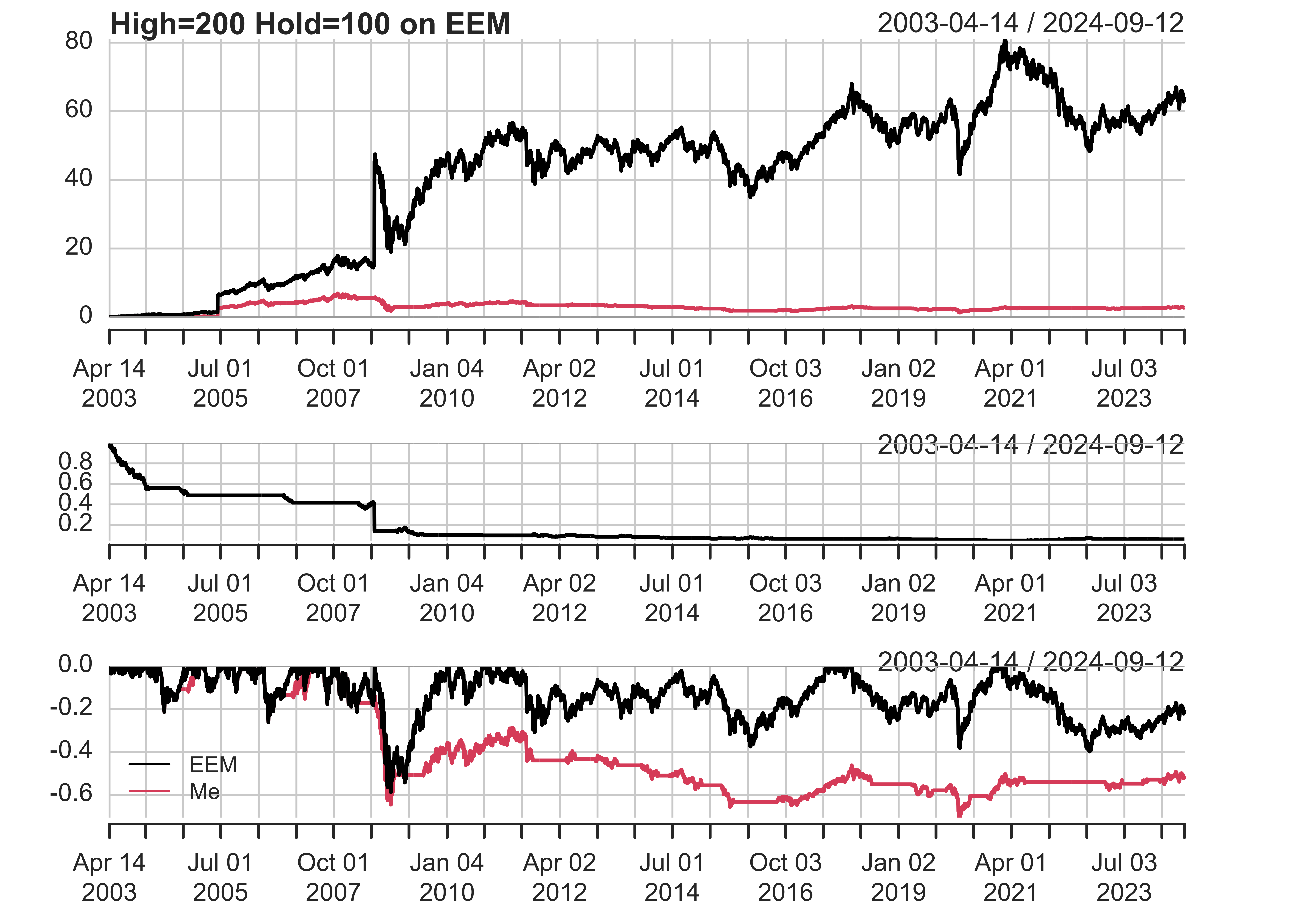
#>                              Me   Index
#> Cumulative Return          3.06   66.97
#> Annual Return              0.07    0.21
#> Annualized Sharpe Ratio    0.14    0.33
#> Win %                      0.53    0.53
#> Annualized Volatility      0.49    0.65
#> Maximum Drawdown          -0.71   -0.59
#> Max Length Drawdown     4380.00 1581.00
testStrategy('EFA',100,200)
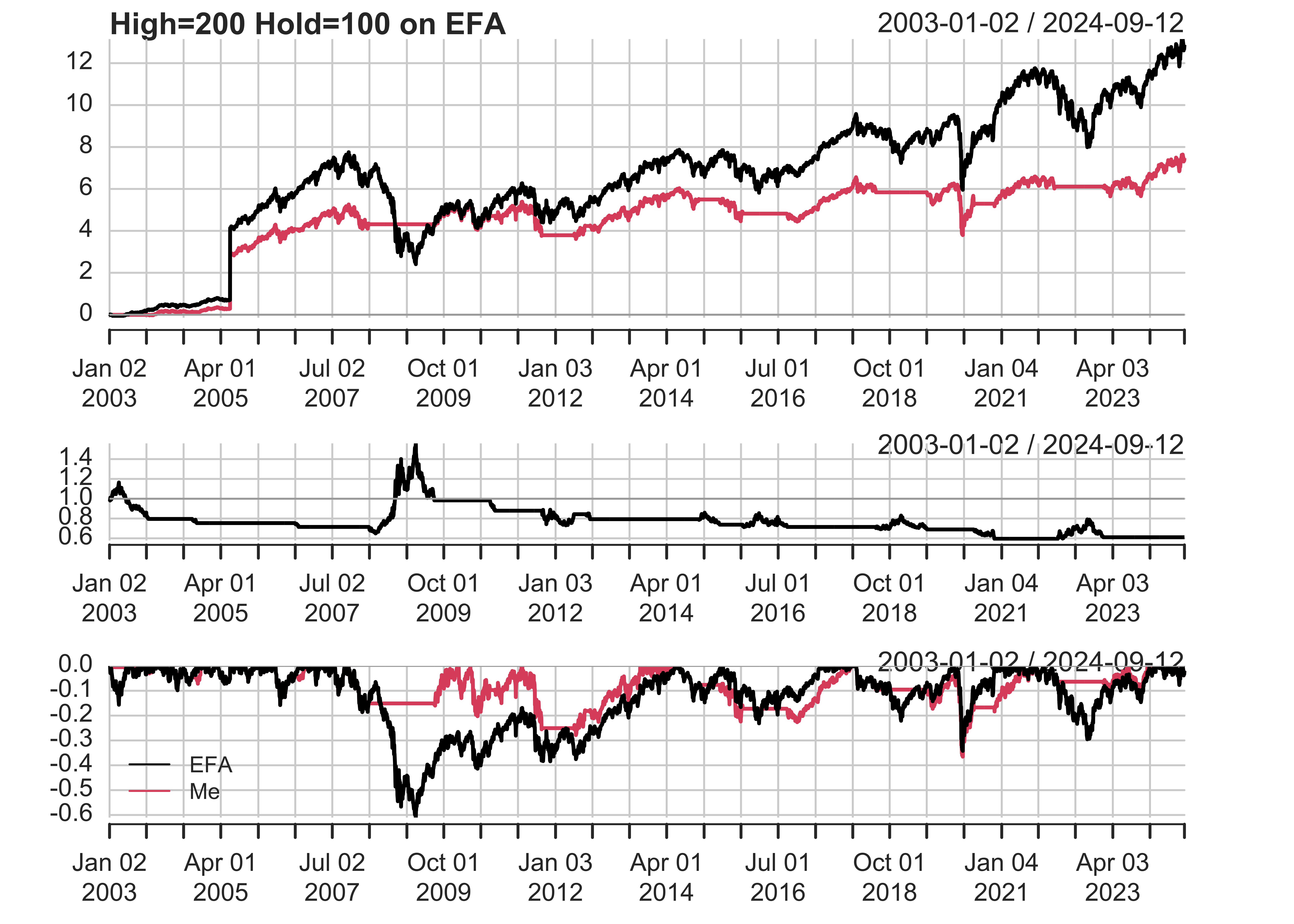
#>                             Me   Index
#> Cumulative Return         7.32   13.25
#> Annual Return             0.10    0.13
#> Annualized Sharpe Ratio   0.22    0.27
#> Win %                     0.53    0.54
#> Annualized Volatility     0.45    0.47
#> Maximum Drawdown         -0.37   -0.61
#> Max Length Drawdown     908.00 1660.00
testStrategy('GLD',100,200)
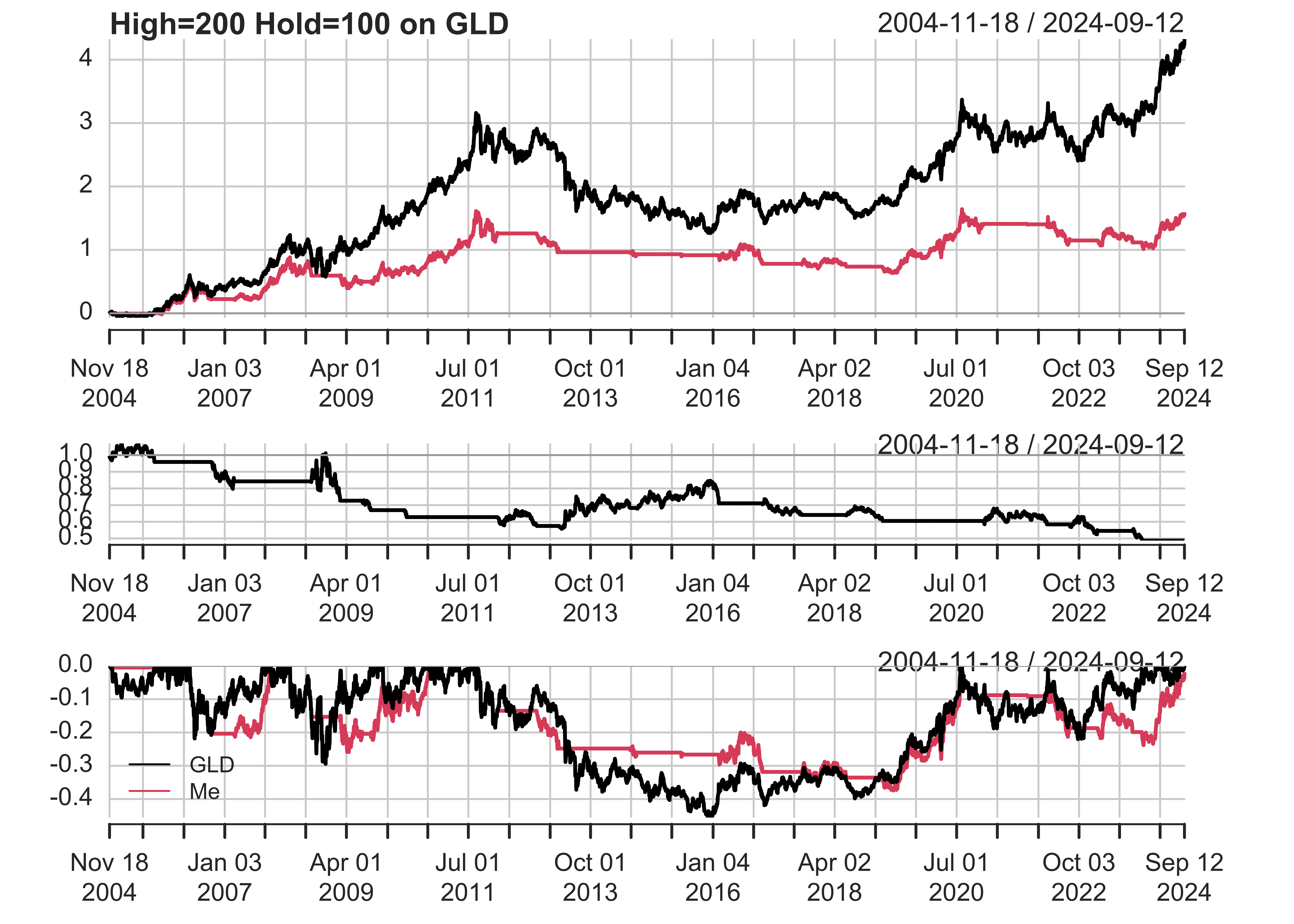
#>                              Me   Index
#> Cumulative Return          2.12    5.40
#> Annual Return              0.06    0.10
#> Annualized Sharpe Ratio    0.44    0.55
#> Win %                      0.54    0.53
#> Annualized Volatility      0.13    0.17
#> Maximum Drawdown          -0.37   -0.46
#> Max Length Drawdown     2254.00 2248.00
As you can see, this strategy tends to reduce drawdowns, but it also sometimes reduces overall returns. In some cases, you could leverage up the strategy, which would increase both returns and drawdowns, but that’s the subject of another post.